Wednesday, 13 April 2011

Week 27 (w/c 11/4/11) EVALUATION (3&4)

3. What have you learned from your audience feedback?

Throughout the production of my product audience feedback has been vital, it allows me to see any mistakes I may not have noticed myself, I was able to see whether or not my work is actually appealing to my demographic.

Newspaper:
At first I wanted to use a name plate that looked like this:


But after receiving some feedback I found that no one really liked this and they would be unlikely to buy the newspaper with a nameplate as plain as this.

I also learned that the layouts I had created did not allow my reader to have enough option in what they read, which is ideal for a local newspaper that is just launching, but I was unable to do this because of a lack of space on the A3 paper I was using. Below is the first mockup of the front cover.


This layout allows room for two articles but it is not obvious which article is the main article. This was something that, according to me feedback, that could deter a possibly reader.

When this didn’t work I tried this cover:


This is the layout I ended up using. This layout received a very positive response from my classmates and tutors. They also suggested that on my nameplate, I should put “Battersea” or “Battersea Edition” so that it is more obvious who the newspaper is meant for.

On the inside page of my newspaper the layout of my newspaper was dictated by the typical conventions of a local newspaper.
From feedback I learned that there needs to be more colour but that I should also keep the “neat” appearance that I have already created.

Ancillary 1 – Poster:

From feedback on my poster I learned that the colours and fonts I have used are the same as the font used on the newspaper, this helps the newspaper be identified through the poster.
I also learned that the clarity of the text on the poster was not clear, and people had difficulty reading the price, and all of the text.

Ancillary 2 – Radio Advert

In order to get feedback on my second ancillary task, I asked a group of people that fit my demographic; males and females of mixed ethnic backgrounds that live in Battersea and are between  the ages 20 and 50.
They listened to the advert and told me it was really good, but when I told them the demographic they were surprised and told me that they did not think it was meant for them. They told me that the reason they didn’t think it was for them is because the woman doing the voice over sounds too young, and her voice was monotonous, and they said that it would be better if the voice over was done by a person within the demographic, that would be the best way to make them able to relate to it. They also told me that the music is too loud, especially toward the end.

I also asked a media studies graduate to listen to my radio advert critically, she told me that: 
1) I need to repeat the name of the newspaper at the end of the advert because people tend to focus more towards the end.
2) The volume of music should be lower.
3) I should have a 3 second opening with just music.
4) It’s important to use a voice that reflect the target audience, so that the audience can relate, especially as they cannot see the person, the voice is very important
5) There needs to be more of a gap between the gibberish and the speech, you can barely tell that she has asked a question and offered a solution.


4. How effective is the combination of your main product and ancillary texts?

I have linked all my print based products through the use of colours, fonts and content. In my main task – newspaper cover and inside page – I used the same font for the articles and headlines, the font used for the nameplate dictated the font for all headings (e.g. “out and about”, and “in todays shout”). My cover page and inside page are linked by the “days out in London” article; I did this in the hope that people that read the cover, and are interested in the article, will follow it from the cover to the second page. This is something that is done often in newspapers, this shows that this method is effective for attracting the attention of readers, because when they see the article they like, they will be more likely to follow it from the cover to the inside. I think that I should have added a few more of these short stories, but due to a lack of space on the cover I decided not to.

In my ancillary products I used words to link the products. On my poster I used words like ‘community’, ‘news’, and the price ‘10p’. The use of the word community is used as a way to tell the reader what the newspaper is about and what it focuses on. As my ancillary products are meant to be ways of promoting my main product, I thought that it would best to make sure that the poster contained only information that will promote the content of the newspaper and its price, which is why I felt strongly about putting text behind the image. Another way I could have done this is to take different pictures and put small captions of what it is about, but if I did it like this it would have been difficult to link it to my radio advert. My radio advert focuses on the fact that this is a community newspaper that is new, interesting and affordable. 


Week 27 (w/c 11/4/11) EVALUATION (1&2)

1. How are you using media technologies in the construction and research, planning and evaluation stages?


In the research and planning stages of my product I was able to use a wide range of media technologies. These technologies enabled me to:research real newspapers and their conventions, select my demographic, select the price of my newspaper, and select the frequency of the newspaper. Media technologies also helped me design and create my Newspaper front page, inside page and poster, I was also able to write scripts, record my radio advert, and edit it. Technology also helped me learn how to use some of the programs effectively.


The Internet:

The Internet was used at all stages of the creation of my Newspaper, Poster and Radio advert.
I used search engines to research my product, even before I had decided I would be doing the newspaper I was able to research short films and how they were made. For my newspaper I researched frequency and pricing of newspapers similar to mine, I found that local newspapers are usually weekly. But because I want my newspaper to always have “up-to-date” information I decided that I want mine to be released every other day, like the South London Press. I was also able to research the prices of local newspapers which never surpass £1, because of this and the frequency of my newspaper I was able to decide that 10p is a good price for my newspaper. I also learned about my demographic using the Internet. I also was able to research my demographic, what appeals to them most, and where they are located. I learned that local newspapers are normally read by the working to lower middle class males and females with children.

Here are some pictures to give an example of my target audience (youngest at the top, oldest at the bottom) these images do not represent the ethnicity of my target audience, this is because I think that local newspapers reach out to all ethnicities within the community. Battersea has a wide range of different races and ethnicities.


I was also able to use the internet to research the layout for newspapers and the colours that are used in newspapers. I researched headlines, and the style of writing adopted by local newspapers, I learned that local newspapers often use language that is easy to understand, colloquial/every day.


When I was researching my ancillary products the internet allowed me to listen to radio adverts without having to listen to the radio, I listened to the radio anyway, but being able to listen to them online allowed me to repeat the radio advertisements as often as I needed to and notice trends such as the amount of times the name of the product is repeated. I was also able to research newspaper posters; this was very difficult because there are a very little amount of newspapers that promote using posters. They may have a plain white background that says the headline of the newspaper, but advertising in this was would not work as a way to launch the newspaper because of the lack of information given.

At all stages of creating my products I used Blogger.com to keep record of all my research, planning and production.

Image manipulation software:


Image manipulation software such as Adobe® Photoshop was very useful because during the production stages of my newspaper I was able to edit all my pictures, for example I edited the following picture:


I have used Photoshop to adjust the contrast and brightness of the image because I was told that the image is too dark in the centre. I also cropped the image to allow the woman’s smile be the focus of the picture, along with the location, which is in the background.

Layout software:


Layout software such as Adobe® InDesign was used when I was planning the layout of my newspaper cover and inside page. I also drew up some layouts but it is much clearer when they are designed on InDesign, I was able to place things directly into the layout I had created, even if just as a mock up.
Below is an example of a layout I created using InDesign.


I also used InDesign to do everything involving text. This is because the clarity of text in InDesign is much better than that of Photoshop.


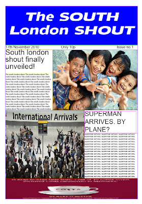
I also used InDesign to create mock ups for my cover page:


I created my cover pace, inside page and poster using both InDesign and Photoshop. I used Photoshop to put all images in place, while in Photoshop I put the text there but only as a guide as to where it would go once it was in InDesign, I made sure to remove all text before putting it into InDesign. When I took it over to InDesign I was able to move all text around freely.


Below is the inside page that I created using InDesign and Photoshop:


Audio editing software:


I used Adobe Audition to edit my radio advert. This was my first time ever using this software so I did some research into how I would use the software. I found out a lot about it, such as keyboard shortcuts and what each button means


When recording the advert I had to use a studio so that the quality of sound was good, we used a microphone and microphone filter and we used ProTools when recording the sound so that we were able to cut the sound, ready for me to take into Adobe Audition in an mp3 file format.

Evaluation stages:


During the evaluation stations of this project I used Microsoft word and PowerPoint to discuss each step taken during the process of making my media product. I used the blogging website Blogger.com to create an online blog.

2. In what ways will your media product use, develop or challenge forms and conventions of real media products?


My local newspaper uses a lot of typical conventions; this is mainly because as a newspaper there are not a lot of ways to break away from conventions, and still be a newspaper.


In my local newspaper I have used a similar layout to what is expected of a newspaper, at first I wanted to have the same layout as the Metro newspaper, but as my research developed I decided that this was not the best layout for a newspaper that is just launching and is only for a local community.  But I did keep some aspects of its layout, such as putting the date of the newspapers release beside the name plate, and placing an advert across the bottom of the page.


I was unable to create a layout for the cover of my newspaper that includes several pictures without losing article and advertising space. I think this is because the size of paper I am using (a3) is smaller than the size 
of paper that is used for a real newspaper.

On the inside page of my newspaper I tried to use as many conventions as possible. I used a similar layout and heading as we would expect to see on a real newspaper.

Another way I have used the conventions of a real local newspaper is my use of images. I have used more than one picture, as most newspapers do, and one of these pictures are linked to the headline. Although, a lot of newspapers do not link their biggest, or main, picture to their headline, I have. So I have challenged this convention, by linking my largest, or main, picture to my headline and article. I did this because I think that it is better to be able to read the headlining story on the front page, then the story can then lead the reader to the inside of the newspaper. In my opinion this is much more effective than placing a large picture on the cover but it has no significance to the article or headline, only a short caption describing what’s in the picture and which page to turn to, in order to read the article. Although, I did use this method, but for the smaller picture that was for the article on the inside page of the newspaper, I did this because I wanted to make sure that I was able to let the reader know that there is another story to read, especially because I was only able to use the cover page and the inside page.

The use of bright colours us typical for all newspapers. This is because in order to sell a newspaper it is important to make sure that it stands out from the crowd. It was also important for me to use bright colours on because the name of the newspaper is South London Shout, which suggests loudness and since this is a print based product, the best way to be loud is through the use of colours.

The font sizes I used are also typical of a local newspaper. I used large fonts, 128 for the headline and 130 for the nameplate. It is as important to use a large font as it is to use bright colours. It will help ne newspaper stand out from all the other newspapers.

A convention of local newspapers that I have challenged is the article. The article I have created is much more up-beat than the news usually featured in a newspaper. Normally, newspapers talk about crime and violence, my article is about the success of a person within the community, which should encourage people within the community to aspire to succeed.

The advertisement I have used at the bottom of my newspaper on the cover challenges the conventions of a local newspaper because I have noticed that normally the advertisements on newspapers are usually for things such as used car sales, bicycles, or carpeting. These are items that are normally seen to be ‘meant for men’, whereas my advert is for a shoe shop called ‘Berties Boots’, this can be seen as a masculine advertisement because of the name, but I have used female shoes to show that the shoe shop is mainly for females.

On the inside page of my newspaper, the advertisement breaks conventions as well. Instead of advertising a product I am advertising, advertising space. This is because the newspaper is brand new and I think that it may not have many advertisers. And it also encourages small local businesses to use this advertising space. This ultimately increases the revenue of the newspaper.

Typically, a newspaper poster does not have a picture of a person on it, but mine does. I did this because I think that it makes the newspaper identifiable. I have chosen to challenge the convention of ‘pure text’ advertising that the majority of the newspaper advertisements usedbecause I think it will make my advert stand out, also because I think people will be able to relate to a picture of a person, as opposed to pure text which they may not be able to read as the drive past the advertisement on the bus stop.

I also incorporated the ‘pure text’ advertising style of most newspaper advertisements. If the image was taken away, this advert would look similar to all the other real posters because there is just text behind it. 

Monday, 11 April 2011

Week 26 (w/c 04/3/11)

The corrections I made left me feeling unsettled, the person still didn’t sound old enough. 


Before recording the advert again I edited the script,  using Celtx. I Edited the script because in the feedback i received from my group of 23-30 year old males and females, I was told that the sentences need to be shorter. Below is my new Script:


Voice over:

Does the news usually sound like this to you?

*gibberish talk for (about) 10 seconds of the advert*

Voice over:
Well with the South London Shout, you are now able to actually understand what is going on in your community. With all the latest news, business, sport and even recommendations on where to spend your weekends! This local newspaper will connect you to your community in a way you have never experienced.
South London Shout! Now at your local newsagents for just 10p.

Approx. 30 secs


So I asked a teacher to help me record it. We recorded it and she told me that instead of using the gibberish I created I could take one of my old recordings and play it backward, this will still cause the audience to be confused by what is going on. We edited the sound in ProTools. 


Below is the final radio advert. I think this appeals to my demographic much more than the previous one because  the voice I am using is of someone that fits that profile.


Week 25 (w/c 28/3/11)

I have had feedback on my radio advert from some 23- 30 year olds and they felt that the girl doing the voice over sounds too young and they thought that it was aimed at 15-25 year olds as opposed to the real 20-50 year old demographic. So they suggested I use an older person. They also told me that the girl sounded monotonous so they suggested that I record it again with an older person with a more charismatic voice, they also mentioned that she should be better spoken because of the target audience (working-middle class 20-50 year old people).
They also said the volume of the music was too high and took over the speech towards the end, and they told me that from the “well, with the….” Is too long, the sentences need to be short and snappy.


I also asked a Media Studies graduate to listen to my advert and she said:

  • I need to repeat the name of the newspaper at the end of the advert because people tend to focus more towards the end.
  • The volume of music should be lower.
  • I should have a 3 second opening with just music.
  • It’s important to use a voice that reflect the target audience, so that the audience can relate, especially as they cannot see the person, the voice is very important
  • There needs to be more of a gap between the gibberish and the speech, you can barely tell that she has asked a question and offered a solution.


I was unable to find a new voice so I have made all the corrections I could with the same voice. 

Sunday, 10 April 2011

Week 24 (w/c 21/3/11)

This week I redrafted my main tasks.
Below is what they look like:


I have also completed my radio advert:

Tuesday, 5 April 2011

Week 23 (w/c 14/3/11)

This week, I have finished recording my first radio advert in our well equipped studio. With the assistance of our highly experienced studio technician, we used a microphone and noise filter to ensure high quality sound was produced. I used ProTools while recording the sound. When we finished recording, I saved the audio file in an mp3 format which was then transferred Adobe Audition for final editing.

Once in Adobe Audition I was able to edit the sound, edit the music add music and create the gibberish. Below is a screen dump of what it looked like during editing.


Saturday, 2 April 2011

Week 22 (w/c 7/3/11)

I have had feedback on my first ancillary product. I have decided that I will use the advert below. I have been told that the others aren't as good and this one doesn't have too many changes for me to make.


I removed all the text from the picture and placed it, plain like that, into InDesign and put all the text back, this is because I was told that the text isn’t very clear and it would be better if I did it in InDesign. I did this and I also changed the colour of the “get yours now” because I was told that it is difficult to read it due to all the background text. The colour I chose is blue from the blue area next to the nameplate; this links the poster to the cover, using colours that are common to both items.


Followers